Mobile App Design – iOS vs Android
A reference guide – UI and UX on iOS vs Android
At Jackrabbit, we design and develop for both iOS and Android, and a big part of making smart design decisions is knowing what users are expecting on both iOS and Android platforms.
We put a lot into design strategy and design thinking, and it is important that we stay up to date with user expectations. Below are a few of our most often used resources:
Look here:
– iOS Human Interface Guidelines and the Android Design Guidelines.
– Testing and staying familiar with new devices and operating system updates.
– Dribbble
– Testing and experimenting with iOS & Android apps.
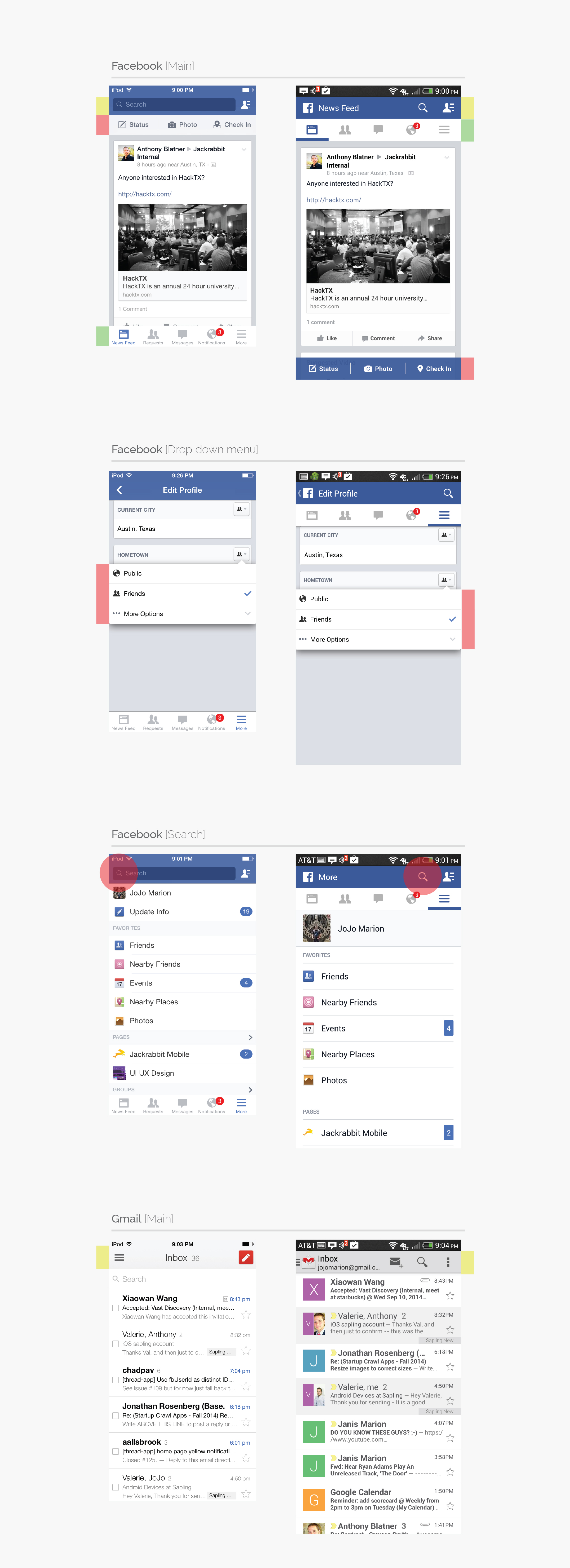
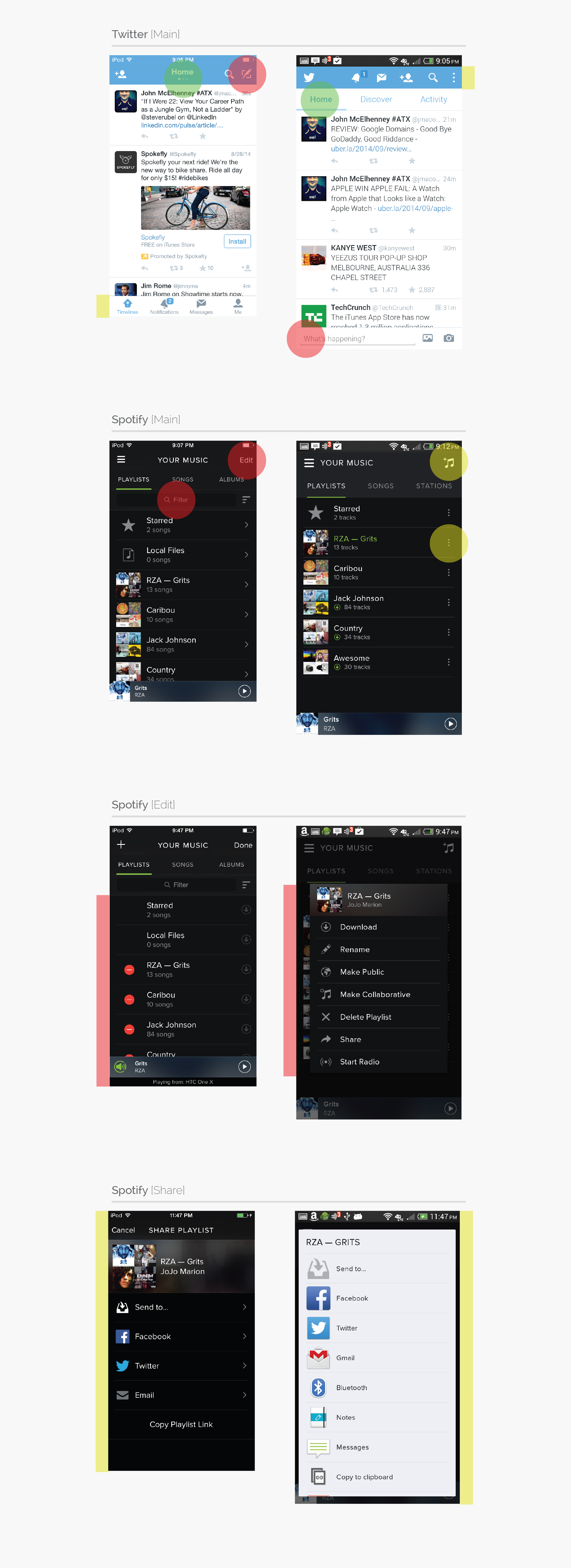
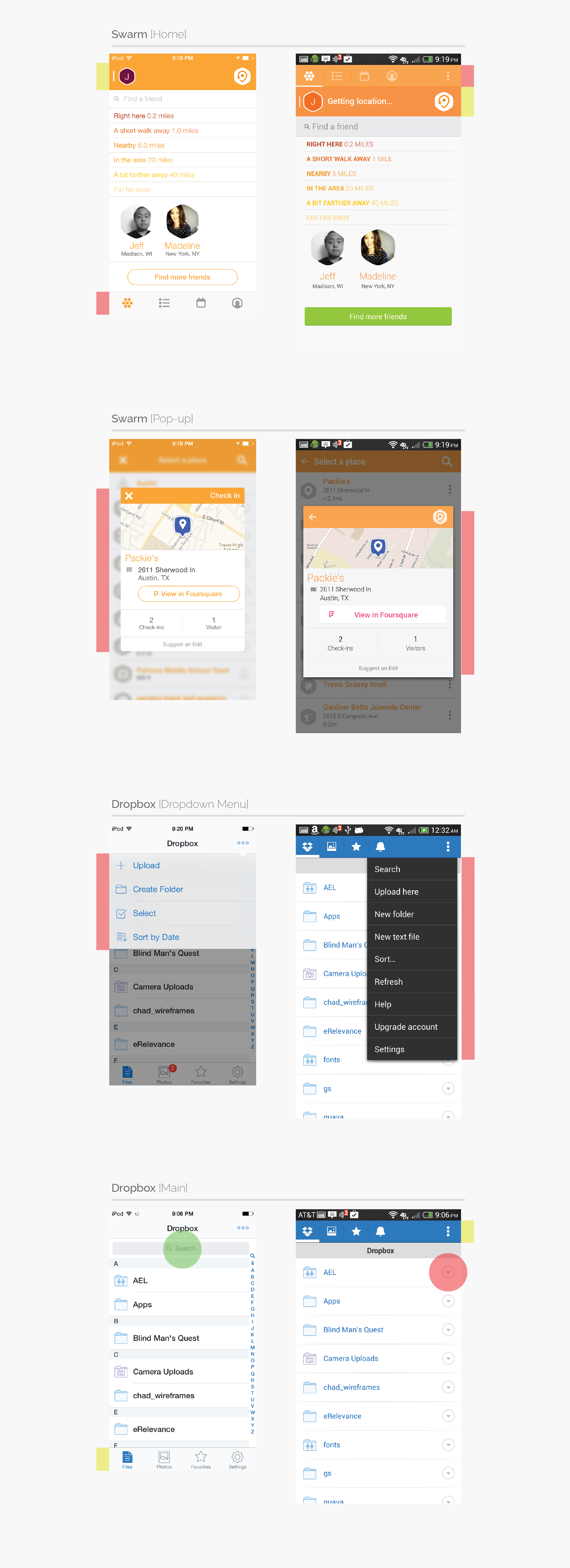
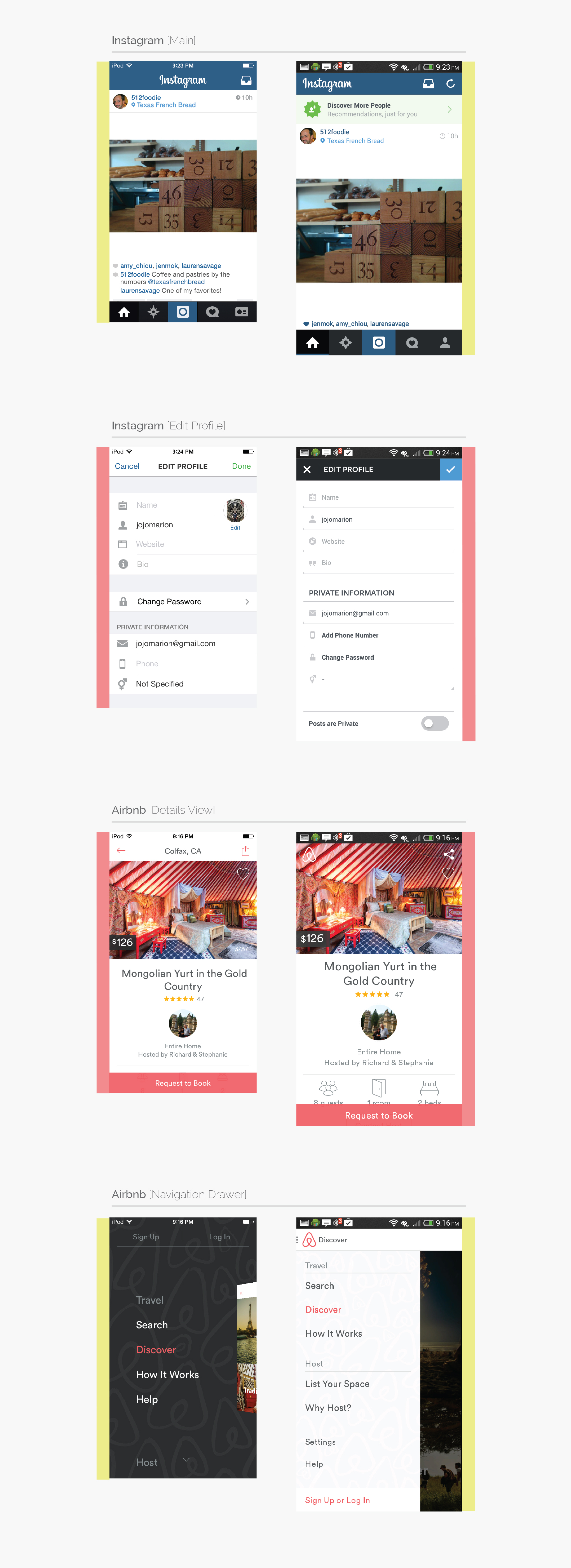
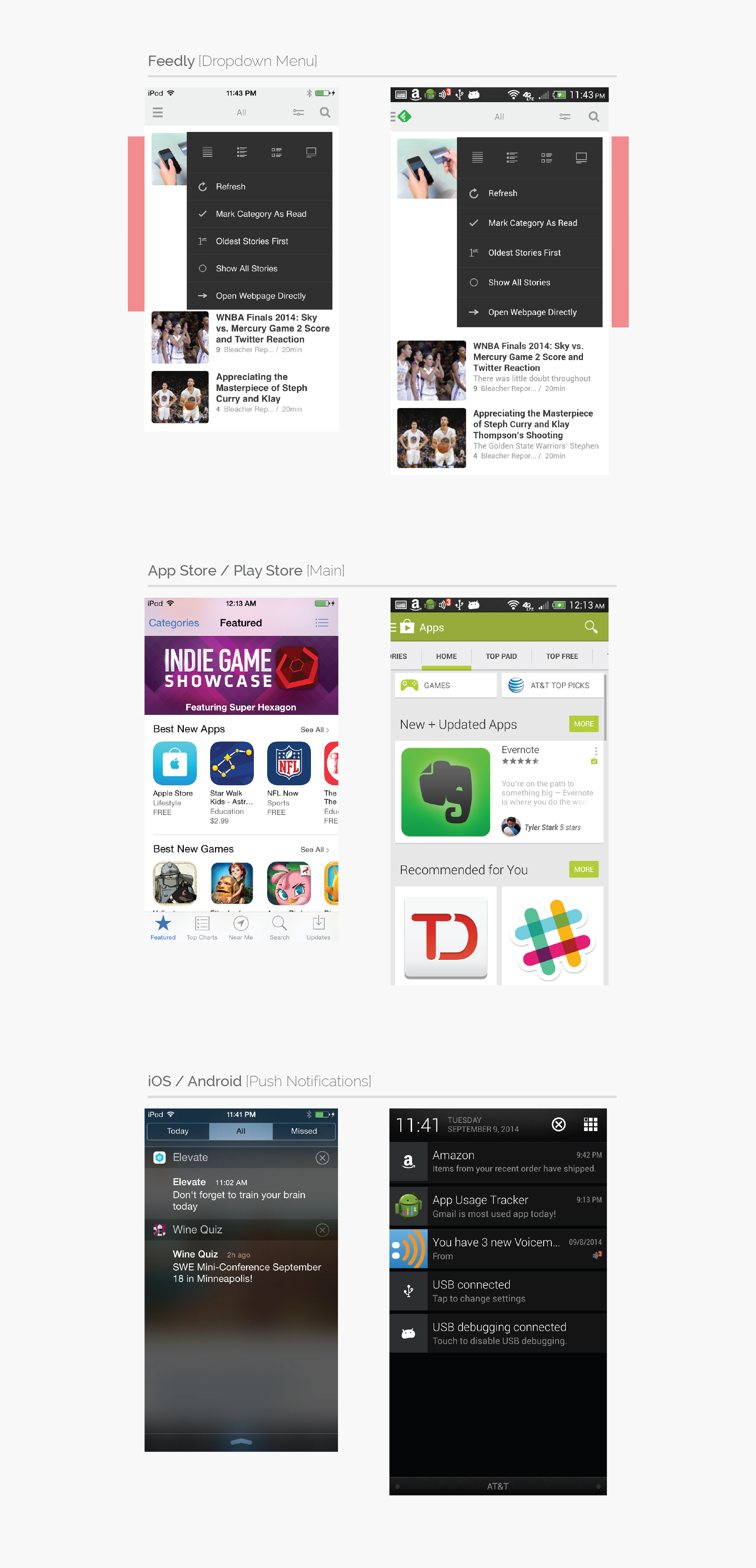
Around the office, it’s common that we have two devices out, comparing iOS and Android features on the same app – so we decided to put together a visual reference doc that we can refer to quickly and use as a visual guide for client discussions. We’re sharing that guide with you here – hopefully you get some use out of it as well.
What’s below:
– Facebook (Main)
– Facebook (Dropdown)
– Facebook (Search)
– Gmail (Main)
– Twitter (Main)
– Spotify (Main)
– Spotify (Edit)
– Spotify (Share)
– Swarm (Home)
– Swarm (Pop Up)
– Dropbox (Dropdown)
– Dropbox (Main)
– Instagram (Main)
– Instagram (Edit Profile)
– Airbnb (Details View)
– Airbnb (Nav Drawer)
– Feedly (Dropdown)
– App store + Play Store
– iOS + Android (Push notifications)


