Anatomy of a Mobile Login Screen
 Login is essential for any application to connect a user to their data, from remembering history, saving progress, to retrieving purchases or achievements.
Designing your mobile login screen is one of the first steps in constructing a mobile experience, so here we’re going to break it down into a science. We’ll show you some examples and best practices of how the most popular apps implement login.
At the bare minimum, a user system requires both account creation and login. Additionally, the following elements are common for most mainstream apps, and you’ll want to account for during your design and planning phases.
- Login
- Social Login
- Create Account
- Forgot Password*
- Other Help*
- More information
- Terms of Service*
- Privacy Policy*^
* Frequently contained in a webview
^ Required by Apple, Google
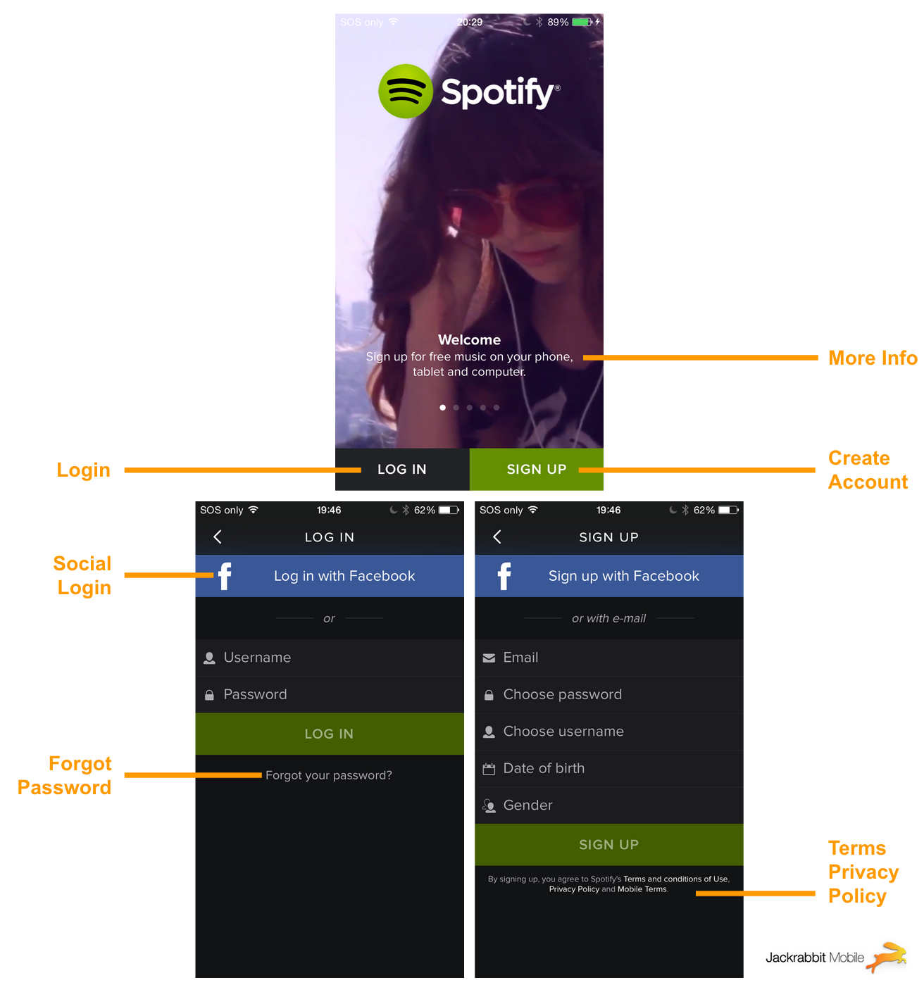
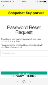
A few of these are shown in web views, as seen in the screenshot examples below. That allows the administrator to modify the content on the fly, without waiting for a user to update their app. If no internet connection is available, the app should fall back to the most recently downloaded, or the initial bundled copy.
I like how many apps take advantage of login screen space to display information and educate the user. Sometimes it’s a short description of the app, and sometimes it’s a series of images explaining how to use the app.
Check out how a few popular mainstream apps handle login — from social to finance to utility apps.
Snapchat
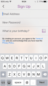
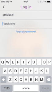
I like how Snapchat subtly uses your camera in the background of the login screen. One more selfie — nice touch. Notice how their forgot password, terms of service, and privacy policy are all contained in webviews.

QuickBooks
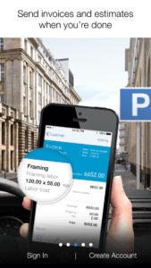
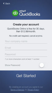
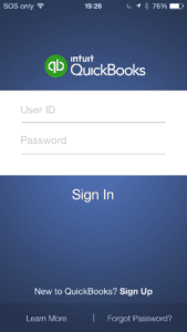
QuickBooks has a polished set of tutorial screens displayed on first open. They do a great job of illustrating a few screens of the app with information, therefore by the time you login, you’re already familiar with the interface.
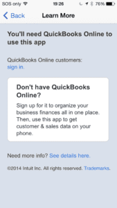
They also have a Learn More link which takes you to their website. QuickBooks is a pretty well known platform, but your app may be brand new. Consider a user casually browsing the App Store and downloading your app because they’re interested, but don’t know anything about it. Give them a way to find out more, so they don’t exit frustrated or confused, leaving a negative review.


Dropbox
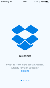
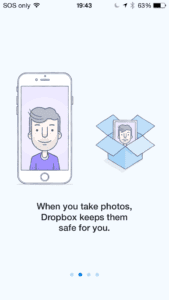
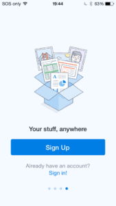
Dropbox also has a nice set of tutorial screens before you enter the app.
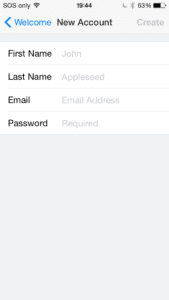
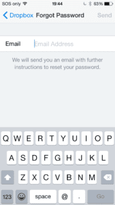
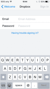
Dropbox does handle Forgot Password inside the app. I prefer this method of handling Forgot Password natively because you can provide a better user experience, as opposed to using a webview, which can be confusing when the app jumps to the browser, and it can also be perceived as less secure.
Keep these in mind when you’re planning out your next application. Cheers!
