Introduction to Android Wear – Integrating Wearables with Your App
Integrating your app with a user’s watch may not be as much work as you think. With the emergence of Android Wear, all apps can now harness the power of wearable functionality. Luckily, Android Wear integration comes in several different flavors and can range from no extra development work to an entirely separate app. Even though only around 40% of Android users can currently use Android Wear*, it’s poised for growth this year and it’s worth taking the time to consider your options with wearables.
Basic Android Wear Summary
Let’s look at how Android Wear currently works and how a wearable app interacts with users. Simply put, Android Wear interacts with its users in two ways: Suggest and Demand.
Suggest: Context Stream
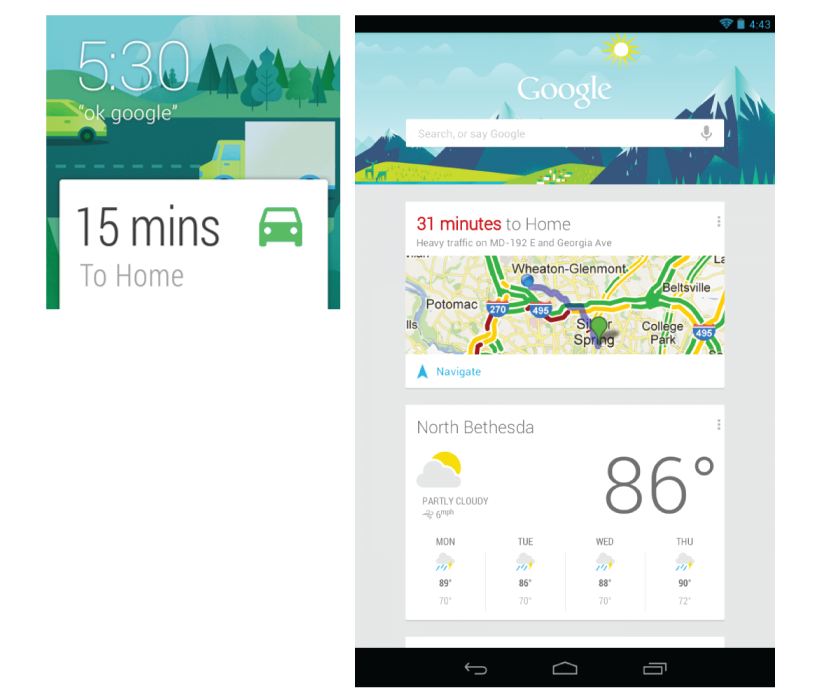
Suggest, or the context stream, is a list of cards that the user can swipe through vertically. These cards can present information to the user or even use buttons to allow users to perform actions from the cards. These cards are meant to anticipate when the user will need them and inject themselves into the context stream when appropriate.
Here is a quick look of a card on a watch in the context stream (on the left), compared to cards on Google Now on the phone (on the right).
So far, Google has done a great job with supplying cards at the right time and has shown that the context stream is currently the core of Android Wear. I recently traveled to New York and noticed a few days before my trip that the weather in NYC popped up as a card in my context stream. When I landed in New York and swiped through my cards on my watch, I saw a basic card showing the time back home in Texas.
While some of what Google does with the context stream hangs on the border of creepy and cool, it has been a hit with users and has been my favorite feature so far of my Android watch.
Demand: Cue Card
The user accesses the cue card by saying “Ok Google Now” or tapping the home background screen. The user is given a list of actions and can either use a voice command to select one of the options or manually scroll through the list. While the watch will come with a predefined list of actions (take note, send text, etc.), as you start to use wear apps you will start to see your more frequently used apps pop up on the cue card. After selecting an item, a certain action will be performed, or the watch will open a full wearable app.
While this feature requires the user to do some sort of work, it also allows the user to be in the driver’s seat. Android seems to be leaning towards using the context stream, but a well-designed app for an appropriate use can really be powerful with the cue card.
A great example is the Hyundai/Blue Link app that was announced recently at CES. A user can open the Blue Link app from the cue card, and then start their car or get directions to their car, all from their wrist.
Does Your Company Really Need a Wearable App?
Bridged Notifications: Little to No Extra Work
Currently if an app sends out a push notification, it will be seen on the user’s Wear device. The user can swipe it away and dismiss this notification both from the Wear device and their phone. These bridged notifications require no extra work and allow the user to interact with your app from their Wear device.
It’s also possible to add actions to your notifications, and let your users perform something basic on their watch. A good example would be answering yes to a calendar invite, responding to a text, or pausing a music player.
Contextual Notifications: Some Work
Contextual notifications are really the bread and butter of the watch right now. After reading the Google documentation it seems like Google is really pushing developers to find a way to use the context stream, instead of forcing the user to use the cue card.
Now you need to think about your user and if you can predict their use and launch a card into the stream at the right time. Try to think if you can pinpoint a location, activity, time of day, or even something happening in the cloud that could trigger you to launch a card.
The example I used earlier when Google provided me with the weather in NYC and the time at home were both launched automatically. Google saw I was going on a trip and grabbed that weather; it knew my home base was in Austin and showed me that time. This is an opportunity to really do something useful for your user and avoid creating an entirely new app.
So far, my favorite example from Google of a contextual notification is notifying any user at the zoo that the penguins are going to be fed in five minutes. Everyone wants to see some penguins eat, no question about that.
A Separate Wearable App: Good Amount of Work
If you think that the contextual stream isn’t enough or maybe just want a wearable-specific app, you can create an app specifically for the wearable. Take the earlier example of how Blue Link and Hyundai puts the users in control.
While starting your car from far away is fun, it isn’t always necessary. I know that Google is really pushing the contextual stream but sometimes you may just need to let the user be in control. In a few years I can imagine a lot of the cue card actions going away with a more polished wearables industry, but for now many apps will need to just provide their user with the controls. Also remember this separate wearable app can be packaged together with your normal app, and will only be accessible to your current user base that has Android Wear. This will be more work than just adding in a card, but allows you to really use the wearable to make your app more valuable.
This separate wearable app for Level (a budgeting/financial app), can be opened from the watch to quickly view your daily, weekly, or monthly budget.
Custom Watch Face: A Different Kind of Work
Lastly we come to the custom watch face. While this is one of the more popular ways the watches are being used, it is very limited. This will not be a traditional app that provides the user with a lot of power. These apps replace the watch face the user normally looks at with a custom watch face that provides some sort of relevant data to the user.
While the majority of apps/ideas won’t need something this specific, it can really be a great way to get in touch with a passionate user base. My current favorite watch face is Surfline. Surfline is a very simple watch face that shows the current tide levels for a specific area. Surfers and fishermen (both very passionate groups, I know from experience), would love to have the ability to see the tide on their wrist.
Surfline itself may have a couple bugs to fix, but this app/feature could really be a powerful add-on to any major app/company. If a surfboard or fishing pole manufacturer had created this app, they would have their logo/name on a lot of users’ wrists 24/7. They would also have all those users showing off their app to new potential users, and strengthening their brand.
Every Use Case Is Unique
I know that was a lot to take in – but the main point of this article is that wearable apps come in all different shapes and sizes. So before you say that you don’t care about getting your app on a user’s wrist, consider how much (or how little) work it would take to implement a wearable feature. Sometimes it may just be the spark that an app needs to be the next big thing.
Thanks for reading and please tweet me @SamIAmHarris with any responses you have about the article.


